03 Typography: Absalom (ISTD)
*Please note some improvements have been made*
Brief summary
Shaping the world
Books are the agents of creeds and have shaped and reshaped humanity - Melvyn Bragg 2012
Books hold power within their words. They are beautiful objects that have the capacity to startle us into new ways of thinking. They are emotive, persuasive and evocative.
Pavilion Books published the title 100 Books That Changed The World, by Scott Christianson and Colin Salter in 2018. Students were required to choose one publication from the book that resonates with them and investigate its significance and how it shaped and influenced the world in social, political, cultural, technological and economic areas. Students need to identify a context and a target audience and build a strategy that underpins the development of the specific outcomes.
Deliverables
01 Strategy
02 Research document
03 Final outcomes
Design strategy
In a world full of smiling Cheshire cat politicians and a Red Queen who keeps reminding us to pay our taxes...we didn't have to fall down a rabbit hole to know that wonderland is the ultimate place of nonsense. Written in 1865, our dearly beloved character, Alice falls down a rabbit hole and discovers the so-called fantasy world of Wonderland. In society, there has always been a major power imbalance between children and adults. Children are seen as a need to be educated to be acceptable to the adult world. The adults in Alice in Wonderland order Alice around and act like know-it-alls, but in reality, their orders are ridiculous and often cruel. Taking inspiration from the hookah-smoking caterpillar and creepy Tweedle dee and dum twins, Absolom is a brand that sheds light on the crazy and nonsensical world of adults. With distorted typography and imagery, the nonsensical tone of the brand will be featured on the packaging itself. Distorting type in such a way that it is still recognizable but abstract, contributes to the nonsensicalness of adults. Bright colours are suitable for the packaging, as it brings a fun and child-like characteristic and chaos and nonsensicalness to the brand. The brand targets individuals who smoke hubbly and who want to have that wonderland experience. The hubbly package will feature 3 types of flavouring inspired by the book's characters and packaged within a book-like box, strengthening the concept of the book Alice's Adventures in wonderland. Creating a hubbly brand inspired by the caterpillar within the book is quite fitting with the concept of nonsense within the adult world. The tone of the brand is whimsical and fun, giving backlash to the principles and expectations of the world.
For this project, I made small improvements mainly in the strategy booklet. The main goal was to fix spelling errors and improve the spreads in the booklet as well as improve the final presentation boards for the strategy document and final Cinema 4D deliverables. Missing elements such as the book's dimensions were also added to the strategy document.
View the new strategy document here
View the old strategy document here
View the full process work here


Our Bubbles- Logo

fff
The Hues- Colour palette
The colour palette consists of 5 colours. The Absalom colours are vibrant and energetic as the brand is quirky and playful. The 5 colours, all quite different work well with the theme of the nonsensical nonsense of the world. As it is a hubbly brand the colours are quite trippy and link with the crazy visuals seen in the books and films of Alice’s Adventures in wonderland.

This is Alice- Visual style
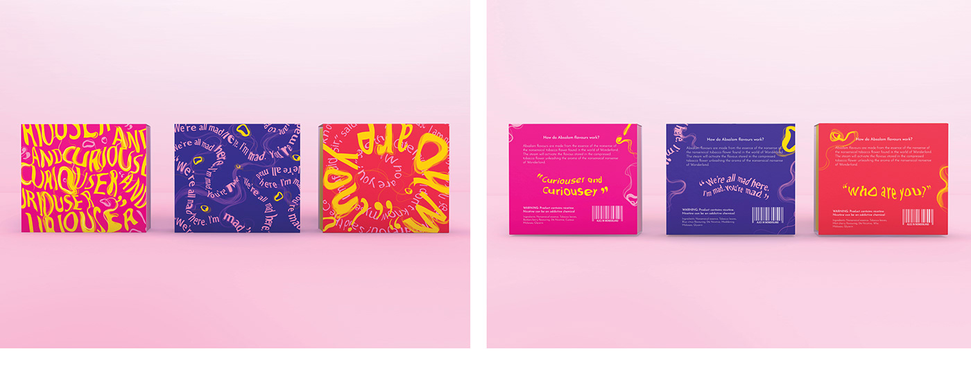
The visual identity of the Absalom brand revolves mainly around the use of typography. The Astoria Roman Condensed typeface is mainly used in creating custom distorted type-based visuals. Patterns and posters as well as quotes within the distorted styles are used as the primary visuals for the brand. To bring across the narrative of Alice’s Adventures in Wonderland secondary illustrations were made of the characters who were used as inspiration for the different flavouring options. These illustrations are mainly used where the flavours are explained on the inner packaging pages.

The flavouring- Typography
The goal of this project was to mainly make use of typography and showcase it as the main element within our design process. For Absalom, a distorted typeface was created, emphasising the nonsensical language that the characters speak in the book Alice’s Adventures in Wonderland.

Planning it out- Netting and grids


Book and box measurements

Alice in Wonderland- Strategy booklet

A hubbly flavouring pack- Presentation boards
Absalom flavours are made from the essence of the nonsense of the nonsensical tobacco flower found in Wonderland. Our explorers have crafted each flavour with the finest ingredients to create the perfect hubbly flavouring. Absalom flavours will transport you to a world unlike any other, a world filled with wonder, courage and adventures you’ve never experienced before. This is your one-way ticket to Wonderland.